A place to read your ride slowly after it ends
Orider Web is less of a fast feed and more of a place to unfold a ride again.
Screen density, explanations, mobile fit, and error handling still need work. The direction is to make maps, elevation, heart rate, power, and fitness changes easier to read calmly.
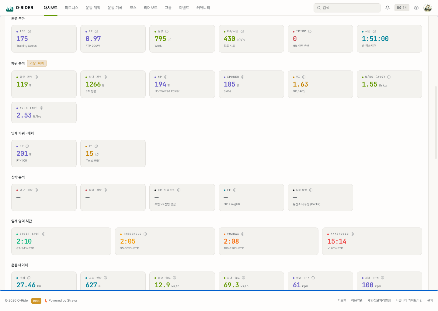
What the web experience contains
| Area | What you see | Why it helps |
|---|---|---|
| Dashboard | Recent activities, weekly summary, key metrics | Understand your personal record and recent riding flow |
| Activity detail | Map, elevation, speed, power, heart rate, laps, segments | Review where the ride felt good or hard |
| Fitness | Training load, recovery, power curve, discipline status | Ride steadily without overreaching |
| Routes and segments | Courses, elevation, leaderboards, exploration | Share routes and compare meaningful sections |
| Groups and events | Group activity, participants, operation dashboard | Prepare and review days when people ride together |
The repeated questions from the development log
The web did not start as a polished display. It grew by fixing places where real ride records were wrong, confusing, or slow.
Filtering unrealistic speed and power, aligning moving time, calculating analysis metrics reliably on the server, and logging errors to fix slow screens have all been repeated work.
That work is still not finished.
- When a record looks wrong, the correction or filtering rule should be clear.
- Metrics such as power, heart rate, and training load should be readable as a flow, not isolated numbers.
- Groups and events should respect location and visibility before convenience.
- Manuals and terms should keep improving so new users can follow along.
- Bug reports and small usability fixes are important parts of the product.
How I hope cycling communities can use it
Ride review
Look back at a shared course or section and prepare the next ride better.
Member activity
Create context for understanding and encouraging each other's riding.
Event operation
Keep participants, rankings, check-ins, and results in one coherent flow.
Language of records
Tell the story of a ride with more context than a simple proof photo.